Floor covering, ceiling… Color is omnipresent in interior decoration. But you still have to know how to harmonize them. A task that is not always obvious, but still largely within reach. You may see it more clearly after reading this article.
Living room, living room, bedroom or kitchen... No matter which room is concerned, the choice of color can quickly turn into a real headache especially when more than two shades come into play. How not to make an unsightly mistake in taste, especially since errors of appreciation can be very expensive if you have to redo the whole decor! Thus, the first rule of thumb is to mix no more than three colors at a time , because the places will be overloaded and the rendering can be very tiring for the eyes.
You should know that the result will be even more surprising if you use the monochrome technique, namely taking three shades of the same color. To play on the tones, do not confine yourself only to the walls, exploit each element and each surface of the room such as the door, the windows, the baseboards, or the woodwork. And even if your first intention is to completely transform the premises, do not also forget to take into consideration the decorative elements present, to name only the upholstery, the upholstery, the material and the style of the furniture...
A color chart, which is a very easy to use tool, will be of great help to you in this reflection. What is its user manual? Just like primaries, colors shown side by side on the color wheel always work well together. There is no risk of making mistakes by selecting them. Otherwise, to obtain a magnificent contrast effect, you will need to combine two colors that oppose each other on the color chart.
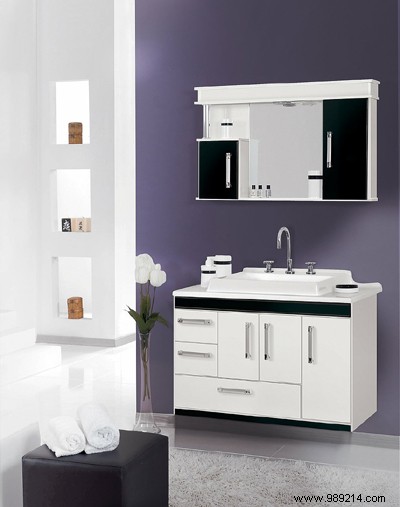
Qualified by interior designers as the "new black", grey, particularly anthracite, is very popular in decoration, especially in the bathroom. Unfortunately, insofar as gray is a bit sad and melancholy, in the kitchen it is advisable to brighten it up with flashy colors, such as apple green for example.

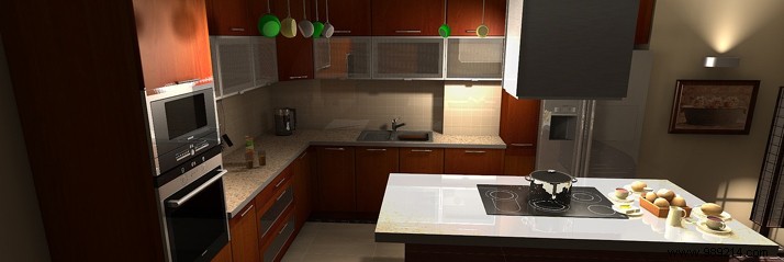
Sanguine, poppy, brick and carmine, both warm and dynamic, red is perfect for living rooms such as the living room, living room and dining room. However, to soften it a little, dark colors such as chocolate brown, taupe and wood will be preferred. And the marriage of red with other warm tones also works very well.
Atmosphere of rest and relaxation par excellence, blue in all its varieties is the color of choice for the bathroom. Nevertheless, in recent years, combined with white, orange and yellow tones as well as natural colors are essential, while blue tends, little by little, to colonize living rooms, bedrooms, entrances. Currently, the most sought-after combinations are Majorelle or Klein blues with chocolate.
Regarding yellow, this color has the advantage of being suitable for all rooms in the house. In the kitchen, it is generally associated with red or orange, but in small touches. Combined with shades of pink, yellow finds its place perfectly in a little girl's room, if not with shades of blue for a boy's.